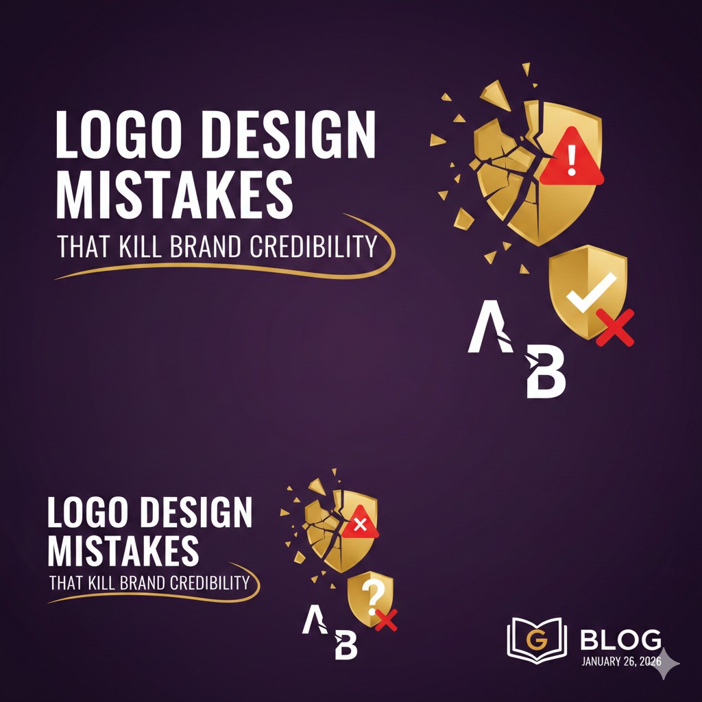
Logo Design Mistakes That Kill Brand Credibility
Your logo is often the first impression people have of your brand. It represents your values, professionalism, and identity in just a few seconds. Unfortunately, many businesses make logo design mistakes that instantly damage brand credibility and trust. Let’s look at the most common ones—and how to avoid them.
1. Overcomplicating the Design
A logo packed with too many colors, fonts, or symbols becomes confusing and forgettable. Strong logos are simple, clean, and easy to recognize at a glance. If your logo doesn’t work in black and white or at small sizes, it’s probably too complex.
2. Following Trends Blindly
Design trends come and go. While trends can inspire, relying on them too heavily can make your brand look outdated within a few years. A credible logo should be timeless and aligned with your brand’s long-term vision, not just what’s popular today.
3. Poor Font Choices
Typography plays a major role in how professional your brand appears. Using overly decorative, hard-to-read, or mismatched fonts can make your brand look untrustworthy. Always choose fonts that reflect your brand personality and ensure readability across all platforms.
4. Ignoring Brand Consistency
A logo that doesn’t match your brand’s tone, industry, or audience creates confusion. For example, a playful logo for a financial consultancy can reduce trust. Your logo should align with your brand colors, messaging, and target market.
5. Low-Quality or Generic Designs
Using stock icons, copied ideas, or low-resolution files instantly signals a lack of professionalism. A credible brand invests in originality and quality. Your logo should be unique and scalable for websites, social media, packaging, and print.
Final Thoughts
A well-designed logo builds trust, recognition, and brand authority. Avoiding these common logo design mistakes helps your business appear more professional, memorable, and credible—setting the foundation for long-term brand success.
Popular Articles


Turning Effort Into Success: What This Video Teaches Us

Zero Click Marketing Explained (2026 Strategy)